Can this be used in the book?
Doug
_________
Hi Doug!
You asked me if I could explain to you how I did some of the graphics in Predator Revealed. I'm not sure if you want me to write a tutorial on the entire piece or just aspects of it. I'm going to guess that you may have been inquiring about the grid pattern behind the panther, the one bleeding into the panther and the grid under his feet. I'll explain, below, what I've come up with in order to get this effect. I'm sure it can be done much faster/simpler in Illustrator... but I wanted to see f I could do it in PS4. If you want my tutorial on the sphere, let me know. I write down EVERYTHING I do! Too much other "real job" stuff bouncing around in my head to try and remember what I've done in my "play time".
DGP Tutorial (Distorted Grid Pattern)
Step 1. Open any image and duplicate the original layer. Name it "New Background". Hide the original layer.
Step 2. On the New Background layer, create a selection around the part of the image you want to morph into the DGP. Make sure there is no feathering on the selection. Either use your Polygonal Lasso Tool, the Lasso Tool or whatever tool you're comfortable with. Once you have your selection made, copy and paste your selection into a new layer. Name this layer "Work".
Step 3. Select the Pen Tool and on the DGP layer, begin drawing a grid pattern, back and forth (don't worry about making the lines equal distance from each other). Once you have a series of lines drawn horizontally across the page, continue the path (with the Pen Tool) bu now drawing intersecting vertical lines. When you get back to the beginning, be sure to close the path. Right click mouse> Make Selection> Feather Radius=0, check Anti-Alias box, New Selection> OK.
Step 4. Edit>Copy>Paste new layer (name = "DGP"). At this time you should have a grid-type pattern in your new layer. Hide lower layers, so as not to distract the eye. Does it look like a checkerboard of different colored off-shaped squares? It should.
(Optional step. You could do this after the next step if you like the result better) Step 5. On DGP layer; Layer> Layer Style> Bevel & Emboss (pick any numbers you like).
Step 6. On DGP layer; Edit> Transform> Warp... tweak to your liking. OK.
At this point you could add the bevel, mess with hue & saturation, add a drop shadow... whatever.
Final Step. Select> Load Selection. Edit> Copy. Open up the doc you want to place the grid into> Paste. Tweak some more.
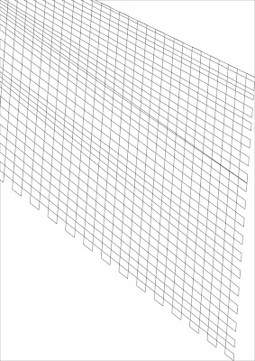
That's it. Really easy. I've included a tiny graphic of Step 3. I converted the selection into 2 pt grey lines, just so you could see the shape.
Let me know if you want my tutorial on spheres. ENJOY!!! :-) Of course, if you have any questions, or I didn't make some step clear, you can always call me or let me know if you want me to explain better in Yahoo IM.
Heather
__________
Heather said:
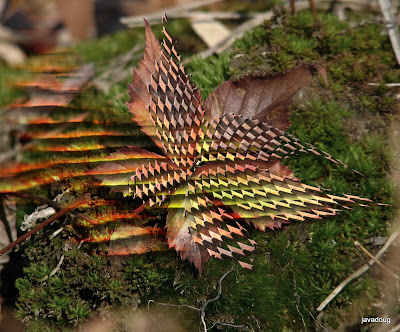
Here is what I was able to do in the last 30 minutes.(see photo above) I was going fast, but the two techniques I used on your leave were the DGP technique I sent you last night and the Motion Blur filter with a hard light. It's not worth keeping... but I just wanted to show you how flexible this "trick" is.
Have fun with it this weekend!
Heather
PS. Hmmm... then what does it say that I can operate a PC almost as easily as a MAC? :-) Though I must confess that I have no idea how all you PC people are not ready to go absolutely "postal" with frustration at "freezes", "crashes" & "fatal errors". LOL!

No comments:
Post a Comment